Search

Space Analogy

HYUNDAI COMMISSION: SUPERFLEX ONE TWO THREE SWING!

I visited Tate Modern’s ‘Huyundai Commission:Superflex One Two Three Swing!’ exhibition in the turbine hall and it was an experience like no other. I never associated museums or galleries with games or activities and this event reshaped the way we interact with works found in exhibitions. I heard a lot about Tate’s swing sets but did not know much about it. But for an exhibit at a museum it grabbed a lot of peoples attention and certainly encouraged a lot of people to visit it, some even twice. After having heard so much about it I knew I needed to visit Tate Modern and experience it for myself.

IMG_8936

(Al Khalifa, 2018)

I decided to do some reading on what the exhibition was about so I could get abetter understanding of what the story behind the swings was. Turns out it was designed by Superflex a collective of danish artists. They wanted to show us what the power of three people combined on a swing can do and we could defy laws of gravity.(Tate, 2018) At first the concept seemed strange, More than one person on one swing? This was when I knew I needed to visit the exhibition and really understand what was all the hype about. So I got in contact with a friend and we met up in the Turbine Hall at Tate Modern. As we expected, It was incredibly full. People patiently waiting on the side for their turn, groups of schools huddled together on the sides. I have never seen such a crowed in a place like this, it was honestly amazing. Everyone in that room could not help but smile, whether they were on swings themselves or just looking at those on the swings. The sense of nostalgia was indescribable we began to get restless waiting for a turn. Eventually we managed to get on the swing, and we just looked at each other and started laughing realising how hilarious it was for to young woman waiting for a turn on the swing. As soon as we began swinging it was an indescribable feeling, like we got transported into elementary school just to kids without a worry. I immediately understood what Superflex meant, in no time the swing started going incredibly fast with the two of us on one long swing. The best part about this is that many strangers got on swings together and did not give it a second thought.

I have never seen such a lighthearted display in a museum, it was an amazing concept brilliantly executed. The following it gained was amazing and they deserve it for such an out of the box idea. I honestly think this is the direction we need to take in our exhibitions, the future is all about interacting with the work on display and not about setting boundaries for those creative souls.IMG_8936

(Al Khalifa, 2018)

Tate. (2018). Hyundai Commission: Superflex: One Two Three Swing! – Exhibition at Tate Modern | Tate. [online] Available at: http://www.tate.org.uk/whats-on/tate-modern/exhibition/hyundai-commission-superflex [Accessed 21 Feb. 2018].



Interview With District Interiors

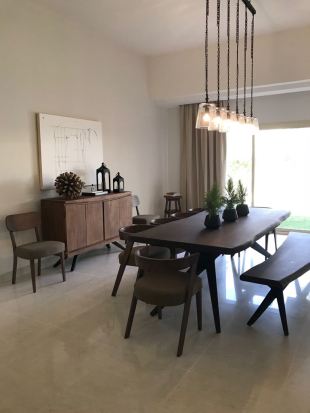
I had an online interview with Noora Al Hammadi creator of District Designs. She is an incredibly talented interior designer who started a freelance career where she works on her own to complete high quality projects. I chose to interview Noora Al Hammadi because she is doing exactly what I aim to do when I graduate from my Spatial Design BA. Bellow are the questions she kindly answered to help me get a better understanding of what to expect in the industry.

IMG-20180222-WA0007
(Al Hammadi, 2018)
IMG-20180222-WA0006
(Al Hammadi, 2018)


1.  What projects do you prefer taking on?

I prefer taking on residential projects. I find that as a designer I am able to identify an individuals personal style easily and enjoy adapting the wants and needs of a person into their home. The relationship between designer and client also differs in residential projects as the project feels more intimate.

  1. Do you ever need to customise pieces of furniture?

Always, customizing pieces to fit a client’s need or a certain space is very important. In my opinion, I usually find that in a corporate project customizing pieces comes up rather more as certain facilities need specific furniture and dimensions.

  1. How long do most of your projects need?

So far, most of my projects take around 2-3 months as I am working solely.

  1. What programs do you use for your digital designs?

Honestly just autocad

  1. How do you deal with stubborn/rude clients?

Dealing with rude clients is always added pressure to any project. I try to please my clients as much as possible without steering out of my scope of work to avoid dealing with any negativity. Being calm and flexible are also important traits to me.

  1. How did you start being a freelance designer?

I started being a freelance designer through social media. I knew I wanted to pursue Interior Design and being a new mum I wanted to be in control of my own working hours, so I started an Instagram page and used it as a platform showcasing inspirational pictures, going around the market and choosing furniture pieces to post to interact with my followers. Once I landed my first project, more requests began to come my way.

IMG-20180222-WA0009
(Al Hammadi 2018)

After having spoken to Noora Al Hammadi I got a better understanding of the industry and how easily you can make your own opportunities if you work hard. The use of social media is crucial in this day and age and she managed to use it to her advantage and gain clients through putting her work out there in a public platform. I am very grateful to have gotten in contact with a professional in the field I intend to work in as I now feel like I have a better understanding of how to get in to the field I intend to work in.

IMG-20180222-WA0014
(Al Hammadi 2018)
IMG-20180222-WA0016
(Al Hammadi 2018)

Narrative and Design

All designs tell a story, whether it is as straight forward as a storyboard or a portrait. With storyboards you are being told a story through a series of photographs, with a rarely any room for interpretation. When it comes to portraits it is relatively different in the sense that although there is a brief explanation to the painting you it is also more or less open for anyone to come up with their own story. Much like storyboards and paintings, architecture is also capable of narrating a story. Some buildings exteriors actually tell a story whether of its history or any current situation.

An example of architecture that tells a story is the Best retail stores. The buildings have an extra layer of brick on its exterior that appears to be demolished. (Arch Daily, 2015) When I first saw photographs of the supermarkets I was incredibly shocked and thought that it was a torn down building. After having a read online I found out that the demolished exterior was all part of a narrative. The exterior was meant to resemble destruction from natural disasters. (Arch Daily, 2015) This is the perfect example of how even architecture can tell a story. It may not be as direct or straightforward as other means of story telling, and may sometimes need an explanation, but architecture has the ability to share a narrative.

best-site_1600px(Carnegie Museum of Arts, 2015)

All types of design are forms of narrative. Although not all are clear and as easy to read, they do tell a story. Always look one step further, there might be a detail that gives a clue as to what the design is trying to say. If not some pieces such as portraits have some sort of description that makes the story easier to understand.


Reference List:

“When Art, Architecture And Commerce Collided: The BEST Products Showrooms By SITE”. ArchDaily. N.p., 2015. Web.

Skjeie, Alyssum, and Alyssum Skjeie. “James Wines: The Architect Who Turned Buildings Into Art”. Carnegie Museum of Art: Storyboard. N.p., 2015. Web.


Gender and Design 

A topic that is rattling social media and young adults everywhere. Did we really achieve equality between the genders? Are we ever going to achieve equality between the genders? When it comes to design there’s an obvious separation in design targeted to men and design targeted to women. It could be something as simple as a soda can, the Coke Zero versus Coke Diet debate. There’s also the ongoing snicker add ‘you’re not yourself when you’re hungry’ which shows a women being over dramatic till she’s handed a snickers bar and turns into a man. With ads and sale schemes like this how are we meant to progress in an equal world where both genders have are heard the same way. Design should not be linked to a certain gender nor should a gender be linked to a design. Colors should not determine whether a design is targeted to males or females and neither should a type of material.

‘Raise boys and girls the same way’ a very commonly heard saying in this day and age. Aimed to destroy the barrier between boys and girls toys, to stop them being separated in toy stores. Just cause a little girl grew up playing with hot wheels doesn’t mean she can’t be a ballerina. There’s a balance that comes with anything in this world, we shouldn’t be catograizeng and labeling everything we see.

I just recently found out that the lego company was mainly advertised to little boys. Did this ever stop me from playing with them as a kid? No. Kids are so naive and don’t see the barriers set but when we start separating girls toys and boys toys that’s where it becomes clear. When lego were confronted about aiming their products towards boys they had a counter that sadly only made things worse. Instead of adding little girls to their commercials or packaging they designed a whole new lego universe. A universe where none of the women were fire fighters or police men, no they were women who’s only goal was to flaunt around the spa maybe get their hair done. What does that tell kids? That women are only good for taking care of the their appearance? Lego would have been better off neglecting the little girls. (The Atlantic, 2016)

I believe that gender and design shouldn’t be linked, and toys should not be aimed towards just boys or just girls. If we want an equal future we need to start where it all begins

Reference List:

LaFrance, Adrienne. “How To Play Like A Girl”. The Atlantic. N.p., 2016. Web.

“Cite A Website – Cite This For Me”. S-media-cache-ak0.pinimg.com. Web. fig.1

“Everyone Should Be Required To Look At This Toy Ad”. The Huffington Post. N.p., 2014. Web. fig.2

Peter Zumthor

Peter Zumthor is an architect born in April 26th, 1943. He rose to fame with The Therme Vals spa located in Switzerland.(Arch Daily, 2017) Despite being put in the spotlight having won awards for his works he chose to stray away from the lavish lifestyle. He is known for his conscious decisions when picking which materials to use for projects, all the materials hold a meaning and play a role. For example, for “The Therme Vals” he used stone which worked harmoniously with the mountains surrounding the building. He also has a skill for using one material and seeing how he can manipulate it to take different shapes and serve different purposes. (Arch Daily, 2009)

(Zumthor, 2012)
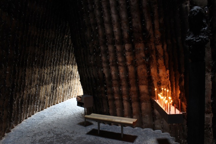
What made Peter Zumthor stand out in my opinion was his passion and the purity of his intentions when taking on projects. Although he has unintentionally created a brand for himself which is his little office in a village, he is not interested in taking on commercial projects for the sake of building a “Peter Zumthor” piece. He asks that clients approach him with a unique design that is built to serve a genuine purpose. (ref from essay) Another project that grabbed my attention was the Burder Klaus Field Chapel, it perfectly shows the types of projects he undergoes. He was asked to to build something that honored German farmers patron saint, Burder Klaus.

(Arch Daily, 2011)
“In order to design buildings with a sensuous connection to life, one must think in a way that goes far beyond form and construction.” -Peter Zumthor (2011).

Personally, I admire his morals and his take on architecture. Not only are all his designs aesthetically pleasing, but the purity of his work makes him incredibly unique in my eyes. I believe that more architects should take his approach, the field would would be filled with passionate architects who work on projects that serve a greater purpose than profit.


References:

“Bruder Klaus Field Chapel / Peter Zumthor”. ArchDaily. N.p., 2011.

“Peter Zumthor | Tag | Archdaily”. Archdaily.com. N.p., 2017.

“The Therme Vals / Peter Zumthor”. ArchDaily. N.p., 2009.

“Ryfylke – Grand Opening Of Allmannajuvet”. ZTH. N.p., 2017. Web.

Do Ho Suh // Victoria Miro

Do Ho Suh is an artist that concentrates on repetition, using stitched planes  of translucent colored polyester fabric he recreates exact replicas of doors, fire extinguishers, household objects and more. (Victoria Miro, 2017) He mostly recreates places which he previously lived such as childhood houses. His work tend to be a balance between his own imagination and his reality. It also tend to concentrate on how the exteriors of homes are “objective” while the interiors are “psychic” which is what gives homes their individuality and makes them more than just a physical structure. (Victoria Miro, 2017)

IMG_4735
(Lulwa Alkhalifa, 2017)

Although these structures he builds seem frail and delicate they are made so they are portable/foldable and fit into a suitcase much like an item of clothing. The decision to make it this was to follow his view on how we are living in an international era, therefore his work should be able to fly from one continent to the other. (Victoria Miro, 2017) What’s most admirable about Do Ho Suh in my opinion is his attention to detail, not just in his work but his reasoning and his choices in material.

Seeing his amazing modules I stood there in awe admiring the delicacy of the fabric. It was only till I stepped in closer that I was able to realize all the intricate details on the door knobs and fire extinguisher. Walking through those structures seeing all the colors change as you walk through one room to the other really created an amazing experience. Each room concentrating different details you would find in those specific rooms.

The Victoria Miro Gallery was the perfect choice to exhibit his work. It’s a very easy location to get to either through Angel or Old Street station, lucky for me it was a 10 minute walk from where I live. The gallery itself had such high ceilings as well which made it all the more better to display his work. It was a wonderful exhibition and I would highly encourage everyone to visit it.

Reference:

“Do Ho Suh: Passage/S”. Victoria Miro. N.p., 2017.

Participatory design: Assemble 

Participatory design is a take on what design can be and in my opinion should be. It is when the artist work hand in hand withhe citizens and take them into consideration when working on a new project. This works best because the residence of the given area are heard and nothing will be done against their will. A good example of participatory designer would be Assemble which are a collective working in the fields of art, architecture, and design. They are unique in what they do because of their distinct way of working. They treat the public as collaborators and insure that they are involved with the project. (Assemble Studio)                                                        (Assemble Studio)

Granby Four Streets is an award winning project led by Assemble with an amazing approach to a common social issue, “regeneration”. This project took place in the heart of Liverpool where they began demolishing Victorian properties which led to breaking apart their ethnically diverse community. Assemble came up with the idea of renovating the remaining ‘Granby Four Streets’. (Assemble Studio) Their plan was to work with the residence of those buildings to keep the rich history and the areas architectural value. The way they approached the residence was by offering training to make sure they are capable of having as much involvement as possible. They also thrive towards creating a nurturing environment where they encourage selfdirected little project which they can undertake themselves while insuring they had access to all the resources they need.

I believe that all projects taking place in residential areas must be participatory. What some designers don’t take into consideration is the lives of the residence and how much of a role they have in affecting their lives. They could be responsible for breaking apart a whole community simply by driving the residence away. This is the main reason residence should have the right to collaborate with designers to insure their daily lives will only be improved through their design.

Reference list:

“Granby Four Streets”, Assemble. Web

What makes a good design?

Depending on who you ask good design can have various different meanings. When asked in class a few words we used to describe good design were durable, communicative, and quality. We later went through a PowerPoint that showed us how different companies judge whether they have a good design or not.

When it comes to postmodernist designers they don’t aim to make a product look ‘pretty’ or like anything you have seen before. Their main goal is to make people question what they are seeing and force them to engage with the design. When your main objective in designing is to get a reaction out of people you might as well throw out all usage of the product itself. The objects shown are clearly not convenient for their original purpose, this is an outcome of a postmodernist designer aiming to create something ugly to be able to make you connect with the product and question it. (Victoria and Albert Museum)

postmodern-montage-2.png
(Mirror 80, 2012)

According to Dieter Rams there are ten principles for good design:                                          (The Interaction Design Foundation, 2017)

  1. Good design is innovative: designing something that has never been seen before, bringing something new to the table
  2. Good design makes a product useful: something that can serve a purpose well
  3. Good design is aesthetic: everything concerning the visual aspect of the object be it the details or the fascination it inspires
  4. Good design is durable: nothing that will go out of style
  5. Good design is concerned with the environment: being made out of recyclable materials
  6. Good design helps a product be understood: having a design that clearly shows the purpose of the product
  7. Good design is unobstructive: nothing too loud, an object that gives the viewers room to see it how they want it
  8. Good design is honest: being true to what it can do and avoid false advertisement
  9. Good design is thorough to the last detail: must preform as well as it looks like it can
  10. Good design is as little design as possible: less is more

In the end of the day good design is subjective and based on who you ask.

Reference List:

“Postmodernism – Victoria And Albert Museum”. Vam.ac.uk. Web.

“The Return Of 1980S Postmodern Design”. Mirror80. N.p., 2012. Web.

“Dieter Rams: 10 Timeless Commandments For Good Design”. The Interaction Design Foundation. N.p., 2017. Web.

Elephant and Castle Renewal

Although I have not lived in London for long, I have grown aware of the worries of the Elephant and Castle residents and commuters when it came to renewing the area. In a recent CTS class we were given this blog that looked into the changes underway and concerns. What seemed to provoke the most nostalgia was the roundabout that is no more. The Michael Faraday Memorial situated in Elephant and Castle where the roundabout once was. People who shared their stories of the roundabout spoke about the beauty of the Memorial’s reflective steal exterior, driving around it made it feel like it was moving with you reflecting your movement as you move. Although this seems like a simple change it seemed to have an impact on those around the area.

In addition to that change it was brought to my attention that the Elephant and Castle Shopping center is scheduled to be demolished. This is a tragedy to many considering all the jobs that will be lost when all the shops in the center closes. As I mentioned earlier I am new to living in London, despite the fact that I am not a stranger to the city and have visited often I am new to Elephant and Castle. When I first started studying in LCC last year I was told that the Elephant and Castle shopping center was not the safest of environments and in the first few weeks I heard of a stabbing and shooting by the center. Now although people will be losing their jobs and that is not an ideal situation, after finding out that LCC will be constructing their new building in that place it did not seem as bad. This means that the space will be put to good use which gives the loss a silver lining.

Change is a fundamental element to progressing and moving forward. We must remember that through palimpsest the past is never lost but rather layered on.

Blog at WordPress.com.

Up ↑